
Case Study
LeaveConsult.com
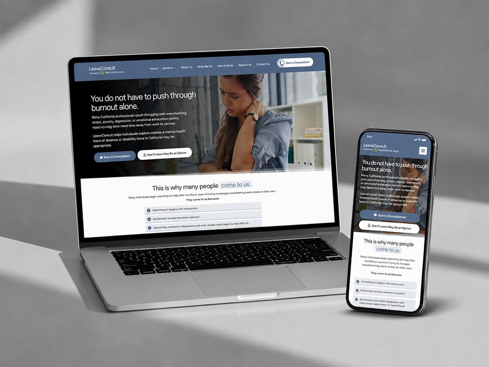
THE PROPERTY
An excellent resource for struggling California workers
An excellent resource for struggling California workers
Their company name says it all. “Heal Before Work…” They believe that no one should have to push through a mental health crisis just to keep a paycheck. But the process of getting leave approved in California is complicated, and most people do not know where to start.
WHAT WAS MISSING
A system that meets people in crisis
Someone searching for mental health leave guidance at 2 AM is usually overwhelmed, anxious, and exhausted. The last thing they want is a sales pitch. They are looking for clarity.
The previous online presence was too limited and general to show up for the specific searches these people were making. There was no structure in place that builds the kind of trust required for someone to begin sharing details of their situation.
WHAT WE BUILT
An asset for a fragile moment
01
Search-First Structure
Every page was built around real search behavior. We looked at what California workers actually type.
02
Trust-First Design
03
A Clear Path Forward
The intake process is clear. It’s easy to schedule a consultation and receive an assessment.
04
Local Authority
The entire asset is built for California. It means understanding that a worker in Los Angeles and a worker in Sacramento are dealing with the same state system but different workplace cultures. The messaging reflects that.
WHAT CHANGED
From invisible to indispensable
The people who reach the intake page already understand what LeaveConsult.com does and how it works. That shortens every conversation and increases the likelihood that someone who books will actually show up and proceed with the process.
The clinical team no longer relies on scattered referrals. They now have a system that brings in the right people while they can focus more on serving clients.
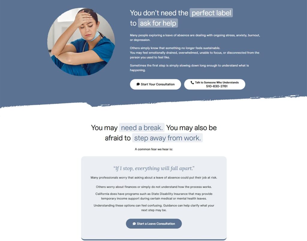
Meeting people where they actually are
Mental health leave is not a purchase someone makes on impulse. It can be a decision people arrive at after months of suffering in silence. By the time someone searches for help, they are often at their lowest point.
What works is meeting them with clarity. The website acknowledges how hard this is. It explains the process in plain language. It offers a next step that feels manageable and beneficial rather than overwhelming.
That is why the intake path converts. The entire experience was built around the emotional reality of the person on the other side of the screen.

WHAT THIS MEANS FOR YOUR BUSINESS
Lessons that apply beyond one niche
- A narrow, focused asset will always outperform a broad website in a specialized service niche
- Trust is built through clarity and empathy, not complexity and pressure
- The right structure turns search traffic into real inquiries from people ready to act
- When the audience is in crisis, the design should reduce friction, not add to it